Choosing the best fonts for your website is like choosing a handwriting.
If it’s ugly no one will read it.
There are 960 font families available for free on Google at the time of this article.
Which is enormous!
And with so many choices, you probably only want to choose the best instead of searching through every single one.
We’ve sifted through the list and found the 26 best Google fonts of 2020.
Here are the best ways you can implement them on your website and benefits like:
- Best for readability (print and web)
- Available font updates
- Least amount of impact on your server
- The best for your SEO
- Installing fonts on your website
- Best practices when installing fonts
A font’s impact on bounce rates and conversion rate isn’t always obvious, but imagine choosing a font that’s difficult to read.
Let’s begin.
But before we begin let’s define the different font types
Serif – A serif is an extension of a character added to the edge of letters. Serifs are best used in headings when used digitally, however, serifs tend to be better used on printed media.

Sans Serif – Sans serif fonts basically get rid of the serifs and are generally best used for digital usage.
The rules of using these fonts do have exceptions, so try and experiment to see what works. Let’s look at the 26 best fonts. P.s. most of them are sans-serifs
And here are the top 26 best fonts in 2020 According to the data.
Google invites users to test and explore all its open type fonts in over 135 languages.
By having them available online, they provide the services to monitor the analytics of the number of views each font receives.
So with employing Google’s Fonts Analytics, we’ll see which are the most rated. This is no doubt fair, as Google has over 33 trillion font views and counting.

We will also look at font combinations and tools to use for selecting the best font combos. Let’s get to it!
1. Roboto
Type – Sans Serif
Styles – 12

Roboto’s Principal Designer is Christian Robertson. Roboto is a combination of geometry and open curves.
Which makes it rigid yet easy flowing.
Roboto thrives in its easy readability as it enforces the rhythmic balance of the letter width gracefully.
This font was originally designed for Android’s System font and has become explosively popular since.
Of Roboto’s 12 variants, you will see Roboto Condensed being the 6th popular then Roboto Slab at 13 along with Roboto Mono at 24 on this list.
2. Open Sans
Type – Sans Serif
Styles – 10
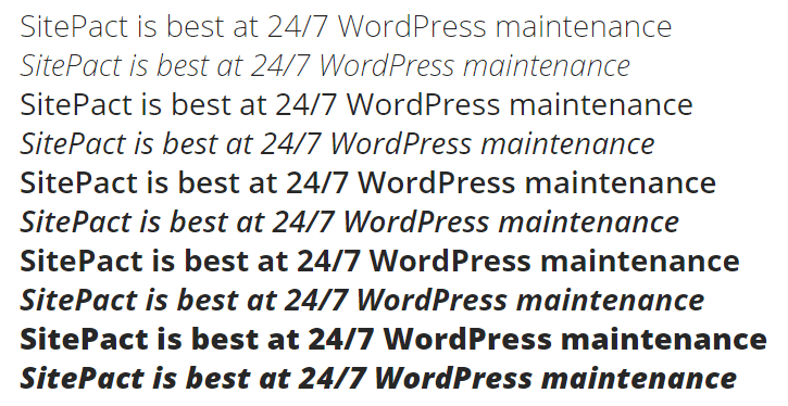
Open Sans was created and is managed by Steve Matteson. Steve is the manager of a global team at Monotype, and also he is the type director at Ascend Corp, with over 25 years of experience in design.
It is no surprise that open sans is at #2 as a humanistic font containing 897 characters. This font’s seamless legibility was designed for optimal use in web, print and mobile mediums.
3. Lato
Type – Sans Serif
Styles – 12

From Warsaw, Germany Łukasz Dziedzic started on the “Lato” project in the summer of 2010 but only published in December.
The font was designed for a large corporate client, however, it was then open to the public.
A simple change of client satisfaction made “Lato” (which means summer in polish) free to use for anyone who chooses to.
As is seen, the Typeface was designed with the parallels in mind of transparency and boldness.
Łukasz wanted the design to be elegant and stylish while maintaining its obvious rigidity, which is similar to the comforting warmth yet harsh embrace of summer.
4. Oswald
Type – Sans Serif
Styles – 6

Oswald is an updated version of the classical “Alternative Gothic” Typefaces. The font was created by Vernon Adams who passed away in 2016 after two years in the hospital. The font was later updated by Kalapi Gajjar and Alexei Vanyashin since then.
Oswald has kept its original use of fitting the pixel grid better and has made improvements based on users feedback. As of January 2019 the updates since creation were:
–Light and bold weights
-Support for latin languages
-Tightened spacing and kerning
-Support for languages that use Cryllic script
-Variable font weight axiz
5. Slabo 27px/13px
Type – Serif
Styles – 2

This font was designed to be used optimally with the pixel dimensions in its name.
Created by Jon Hudson of Tyro Typreworks, Slabo is designed for your online advertising and other web needs.
6. Roboto Condensed
Type – Sans Serif
Styles – 6
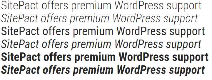
This is a condensed version of Roboto, so the width of the font is tighter.
7. Monsterrat
Type- Sans Serif
Styles – 18

Monsterrat was created by Julieta Ulanovsky as a tribute and refresh to the typography originally located in Monsterrat Buenos Aires.
This modern font aims at contrast, so there is clear distinction between the light and darker styles as it transitions.
The project has since been updated by Jacques Le Bailly to make the regular weight better in longer sentences.
Since then, various other designers have joined in to make the font support Cyrillic characters.
8. Source Sans Pro
Type – Sans Serif
Styles – 12

Developed by Paul D. Hunt, Source Sans Pro’s Sans serif design was created to work well with user interfaces. Therefore, it was created for Adobe as its first open-source font.
9. Raleway
Type – Sans Serif
Styles – 18

Raleway was designed to be used in headings and large size requirements.
Originally designed by Matt McInerney in only one weight, the font has then been updated to nine weights and then iKerned by other artists.
10. PT Sans
Type – Sans Serif
Styles -4

ParaType creates fonts for international multilingual users. There is also a Serif alternative to PT Sans.
The main font was developed so that Russian users could interact with it in their native language.
PT Sans is primarily based on humanistic designs which makes it ideal for relatability with digital use.
11. Open Sans Condensed
Type – Sans Serif
Styles – 3

The Open Sans font has been condensed to make the letters appear tighter and taller in character.
12. Roboto Slab
Type- Sans Serif
Styles – 4

The slab version of fonts offer thicker and more “block -type” letters, so Roboto Slab enforces its readability with these characteristics.
13. Lora
Type – Serif
Styles – 4

Lora is a well designed Serif font with common connections in Calligraphy.
Because of its artistic nature, it serves to be memorable yet modern and creative.
Lora is used mostly on screen, however, it works just as well in print media.
Lora was created by Cyreal, which is a team dedicated to brilliant open-source fonts.
14. Merriweather
Type – Serif
Styles – 8
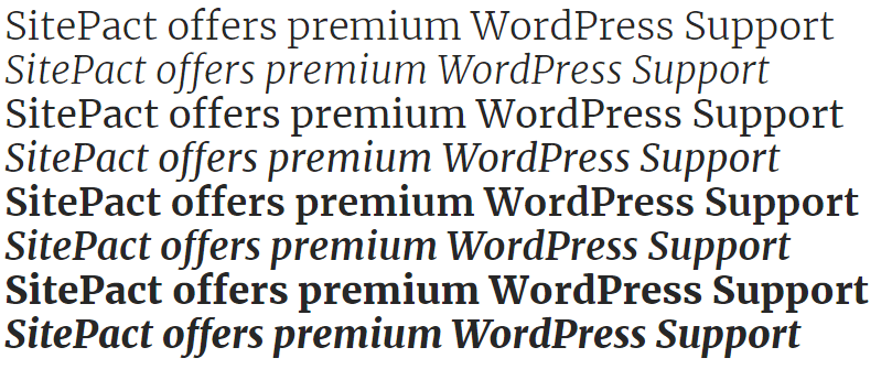
As a serif font, Merriweather’s strength is in print, however, this font was designed to be delightful when read on screens.
Merriweather was designed by Sorkin Type, which also created a sans version of this font that harmonizes with its slightly condensed characters and sturdy serifs.
15. Ubuntu
Type – Sans Serif
Styles – 8
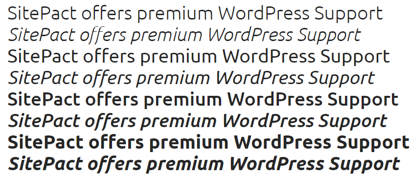
Dalton Maag, the creator of this font, offers Ubuntu font to give personality to the letters when seen. Because of this, it has made its way into Ubuntu’s menu, buttons, and dialogues.
The font organizes with Ubuntu’s philosophy of inclusivity.
So, it aims to increase its extensions as more diverse users from different regions use it.
16. Noto Sans
Type – Sans Serif
Styles – 4

Noto was created by Google to eliminate characters that are not represented by fonts.
Because of this, Noto includes over 30 scripts and so it aims to eventually cover all of Unicode.
Noto is a derivative and improvement of Droid font and you’ll find it has a sister font Noto Serif
17. Playfair Display
Type – Serif
Styles – 6

Playfair Display is an offer from Claus Eggers Sørensen, and with its traditional design can be paired nicely with the Georgia font for body compositions.
This font is also accompanied by a small caps family which is often included in the source files.
18. PT Sans Narrow
Type – Sans Serif
Styles – 2

PT Sans Narrow is an addition to the PT Sans family, which is developed to be used in economic settings.
19. Arimo
Type – Sans Serif
Styles – 4

Arimo is another font designed by Steve Matteson that blends with the Arial font.
This font takes care of the needs of width-dynamics for better-shared document designs.
20. PT Serif
Type – Serif
Styles – 4

Another addition to the PT family is PT Serif.
This font goes hand in hand with metrics and designs with PT Sans and so they blend in seamlessly.
21. Poppins
Type – Sans Serif
Styles – 18

Indian type foundry created Poppins so that it could support Devanagari and Latin writing systems.
Poppins offers almost perfect monolinear capabilities as well as visual corrections in order to maintain consistent typographic color.
22. Titillium Web
Type – Sans Serif
Styles – 11

Multiple designers have created Titillium as an ongoing academic project. Because of its continuous nature, the creators at Accademia di Belle Arti di Urbino allow students yearly to continue its development.
The evolution of Titillium is definite yet open for contribution.
So participate by giving ideas.
You could see your concept in the next update.
23. Muli
Type – Sans Serif
Styles – 14
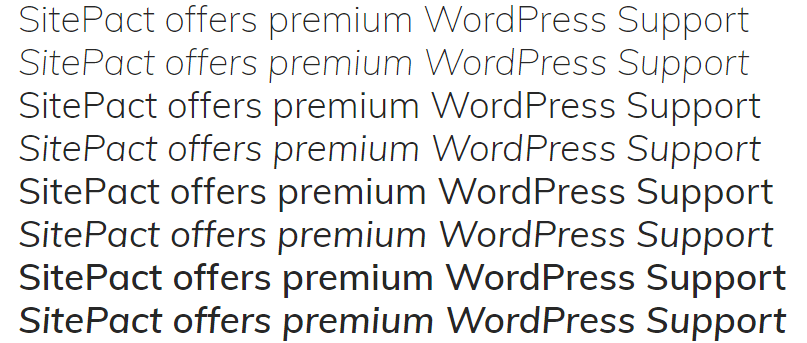
Vernon Adams created Muli as a minimalist font that is for display but can be used for text as well.
24. Roboto Mono
Type – Serif
Styles – 10

Roboto Mono borrows from Roboto condensed for some of its characteristics.
It is a monotype, so, therefore, there will be similar characteristics from its parent font.
For this font, there is more emphasis placed on punctuation as well as serifs added to narrow glyphs to make them more readable.
These fonts, like the rest in the Roboto family are also optimized for readability across different platforms.
25. Bitter
Type – Serif
Styles – 3

Huerta Tipográfica is an Argentinian foundry founded in 2009. They created this font for the strength of print, but it has been optimized for comfortable reading online.
With a humanistic design in mind, bitter excels in both good looks on-screen and on paper.
26. Nunito
Type – Sans Serif
Styles – 14

Nunito is another font created by the late Vernon Adams. However, it was expanded by Jacques Le Bailly to a full set of weights.
With That Let’s look at Best Practices for using Google fonts in WordPress.
Combine the best fonts with the best practices and you’re sure to have an optimized website.
With so many ways to jump in and start picking fonts, there are a few ways to get it right.
Knowing the right font to use, by finding the best of the best, will add to SEO and your website’s performance.
You may have to try different combinations, but this is guaranteed worthy of your time.
We’ll get into a list of best practices but this is by no means exhausted.
First of all: How to add fonts using a plugin
Fonts can be added in a variety of ways, but the easiest way is to use a plugin. For this demonstration, we are going to use the Easy Google Fonts Plugin.
Step 1. Install and activate the plugin.
Navigate your dashboard to Plugins>Add New>Search : (Easy google fonts)> Install>Activate

Step 2. Start using the plugin.
Once the plugin is activated it is ready to be used. With the stylesheets loaded, navigate to Appearance>Customize>Typography.

Once you select an option you will be able to choose styling, appearance and positioning. Even with this method, you can still overwhelm and slow down your website so keep the following practices in mind.
Now, You should limit the number of font weights you use.
When using fonts you want to not load all the styles because this will slow your website speed drastically. Instead, use only the three most necessary font weights for you.
A popular choice is just using Regular, Bold and Italic.


Then Choose fonts that have an active support
A font updated regularly is a font to be used because it keeps up with technological advancements.
All fonts on this list get good support, but if you choose to venture outside, you should always check their GitHub releases to see if they have been keeping up with updates.
Pick the right font pairs
This is purely for beauty, however, it is highly important.
You have to experiment with font pairs in order to find the ones that work for your website sometimes even taking feedback from your visitors.
You can use a tool like Font Pair to gauge the best font combinations to use.

This method is purely based on data but you should always ensure that you keep accessibility in mind. Though some fonts match aesthetically, your readers might have a hard time reading them, so ensure that the fonts you choose are readable. WPCity has compiled a list of 100 fonts with many use cases which should further give you some idea of how to utilize some of the best google fonts available.
Feel free to reach out to Sitepact support if you need help adding new fonts or other aesthetics to your website. We offer 24/7 support for WordPress websites with unlimited content edits. Think we missed any great font? Let us know in the comments or over on twitter
Check out our last article: What is WordPress? For Beginners
